
The Waves (2015) Major Work Analysis and Process
Background Information
The Waves (2015) is a dual screen, single channel projection that is inspired by Jeffrey Shaw’s artistic practise. Two of Shaw’s works that gave me the most inspiration for this work are his 1985 work titled The Narrative Landscape and his 1988 work titled The Legible City.
The artistic focus of The Waves (2015) was to take Shaw’s works to the next level and use his idea of the space beyond the frame and make it grandeur (to make it impressive, especially in appearance or style), in this case I have done both. You wouldn’t normally see water this colour and the background behind it makes it look like the viewer is either witnessing this during sunrise or sunset, which also gives it a wonderment component in the sense that the audience would probably be wondering, when is this happening.
From a personal perspective when I was designing The Waves I was thinking back to high school, where I wouldn't pick up emotions in body language as well as other people did due to my high function autism (Aspergers Syndrome). As any child does when going through a transitional phase such as puberty I had information coming from all sides and deciphering it was a bit of an issue. To me the waves represent those states of flux and turmoil when the world doesn't make one hundred percent sense, but then again when does the world ever make perfect sense.
End result of The Waves (2015).
I decided with the help of fellow peers and in consult with my tutor Mat, to use both the circular and rectangular screens. I personally decided to use both screens as it gives the viewer a different perspective of the same work, and because I wanted to go against the norm and use a screen that you wouldn’t normally see in a gallery space.

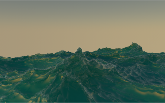
The Waves (2015) on the circular screen.

The Waves (2015) on the rectangular screen.
Process
The Waves (2015) started off as an experiment with an algorithm that allows the user to manipulate the shape and speed of the waves by using a plugin called HOT4D (http://www.valkaari.com/?cat=40).

From here I experimented with the seed (preset motion of waves), the choppiness (in the plugin it’s called Chopyness), the time (how long it takes for each wave to use it’s motion) and adding in the Vertex, Foam and Particle maps. This is what it looks like with those three added in. Once I had chosen what seed to use I had to go to the timeline window and make sure that Linear Interpolation was selected (this is used to make the animation more seamless).

Timeline Window for The Waves (2015).

Painting the Vertex Map for The Waves (2015).

Painting the Foam Map for The Waves (2015).

The Particle Map from The Waves (2015).
After adding the Vertex Map. I introduced a matrix which makes shapes on all of those points, in turn giving the ocean it’s depth and somewhat natural look.

Vertex map with the Matrix turned on from The Waves (2015).
I then added the Environment and the Sky which adds the yellow coloured background and we get a result that looks like the picture below. The PyroCluster on the environment is used to duplicate the number of points where the foam map has been painted.

The Waves (2015) so far.
After I had added in the maps and the matrix it was time to make them do their jobs. This is done in what is known as the XPresso window. From this window we can tell the program when do use / start specific functions. In this case I used XPresso to set the emitter position and when and where to birth and position the particles and how they are affected by gravity.

This helps the scene act more like an ocean, but now I needed to find the best spot to place the camera. I had a bit of trouble with this part. In particular frames I would end up with the background showing through the water. This is shown in the following picture.

Once I had realised this issue my project had after rendered for about 28 hours. I had to move the camera and think about a better way of rendering this. I moved the camera so that it was actually right above the water and now it looks like this after eight days or 192 hours of rendering on one of the University computers.
I’m glad I did wait the eight days, because I’m really excited about the second picture than the first, even though you can see parts in more detail which is a good thing as I think it also invites the viewer to be immersed in it because it is so up close and in your face, that it gives the idea of the ocean being right in front of you.
I personally think I could expand this work more by using it as a benchmark and to always try and make animated works that give the same effect of grandeur or interactiveness. I say interactiveness because on multiple occasions on the exhibition night I saw people tracing the waves with their hands and some people would even reach to touch the screen to make sure they weren’t dreaming or seeing something that shouldn’t have been there.
I’m also grateful that I had fellow peers that were able to look at the work. Thanks for all your help Zema and everyone else of the MEDA301 group. I would also like to thank Mat for all the help and insight you gave us over the semester.